Thursday, December 11, 2008

Stem and Leaf plot


The Stem and Leaf plot above describes the ages of people at a family reunion. The stem is the number in the tens group, while the leaf makes up the numerals in the ones group. The numbers are always listed from leas to greatest. When many data are grouped together such as those in the 0 group and those in the thirties it is considered to be clustered. Stem and leaf plots help arrange data in an orderly manner.

Boxplot


The box plot above describes how anxiety level effects test scores. In order to make a box plot one must gather information about how many people have low anxiety levels, moderate anxiety levels, and high anxiety levels. Then they must measure the test scores of those who they gathered anxiety data from. As one can see in this plot it seems that the concluded evidence is that those students whom have the highest anxiety levels complete their tests with the highest scores as well.

Histogram

The histogram above is comprised of two axes the Y axis which represents the number of students and the X axis which represents the Score on the final exam. Histograms can be used to measure numerous amounts of data. They are good tools in reviewing how a class is being taught such as the instance in the histogram above, and how children are learning. Histograms can be used to gather information and make objectives about how things are being done.

Parallel coordinate graph


The parallel coordinate graph above is a demonstration of a geometrical method used to scale dimensions through parallel lines. The lines usually begin at the lowest possible value and then fluctuate throughout the graph dependent on what is being measured.

Triangular Plot


The triangular plot above describes three descriptions of the specific land area; the amount of clay, sand, and silt. Triangular plots are used to that a viewer can gather numerous amounts of inoformation about the land area.

Windrose


The windrose above is a map used to describe wind speed in a given circumference. This map is broken off into 7 seperate windspeeds. These windspeeds are useful for air traffic controllers because they can look and see when it's safe for planes to fly into a specific area or when conditions are too rough to land or take off.

Climograph


The climograph above demonstrates the climate changes that occur in West Mexico. The blue bar graph demonstrates the amount of rainfall that averagely occurs each month in mm. The Red line describes the temperature in the region throughout the year in degrees celsius. Climographs are good tools to use when figuring out how vegetation grows throughout the years, and why droughts may occur throughout the year.

Population Profile


The population profile above describes the population of the US taken from the census bureau. It demonstrates three generations 1970, 1980, and 1990. Then it describes the amount of living Americans during those eras in 4 year increments by age. These population profiles are useful tools in determining life expectancy in generations to come, as well as determining fluctuations in data and time periods in order to study unusual circumstances.

Scatterplot

The image above is a scatterplot that describes the fluctuation between a husband and wife's age. As you can see for the most part the ages are fairly equal, but in some cases there are areas where the plots are out of the ordinary. The scatterplot is used in this scenario because there are not always going to be equal cases, and in order to demonstrate this you must be able to scatter your data.

Index Value Plot


This index value plot demonstrates the volatile changes in the market from month to month. The plot is a common tool used to measure daily stock values.

Wednesday, December 10, 2008

Lorenz Curve


In this depiction of the Lorenz Curve the independent variable is income, while the dependent variable households. If the distribution of the households was equal you would look at the blue line which is the line of equality, but because we are looking at an economic scale this is hardly feasible. Therefore the Lorenz curve is depicted in order to show the space between the line of equality and the curve as the space of inequality.

Bilateral Graph


This bilateral graph describes two variable between 1980 and 2004. The comparable variables are the amounts of high corporate net lending how it effects the amount of widening current account deficit. A bilateral graph is a graph which demonstrates two comparable variable on one line demonstrating the correlations between the two.

Nominal area choropleth map


This nominal area choropleth map descibes the GDP in USD billions for each country around the world. This map is nominal because it does not have a specific order, however it gives nominal detail, and a specific color key to describe the quantitative analysis.

Unstandardized choropleth map


This map is an example of an unstandardized choropleth map of the number of intersection related crash fatalities in Califonia. The map uses numerical amounts and the numbers are not averagely distributed.

Standardized Choropleth Map


Unlike the unstandardized choropleth map which just uses numerical values, this standardized choropleth map averages variable fatalities per 100,000 population for all counties in California. The map demonstrates the amount of alcohol related deaths using the same denominator for each county in order to standardize the information.

Univariate Choropleth Map


The image above is a univariate choropleth map that describes one variable which are the the changes in table trout in England and Whales. The one variable is the amount of fish in each region. The reason that the graph is not bivariate is because it has only the one measured variable.

Bivariate Choropleth Map


This map is an example of a bivariate choropleth map. The map demonstrates two sets of data which are combined together in the key to the left of the picture of Africa. The two variable that are blended together to create the colors on the map are Gross National Production and life expectancy in year. Through the use of two variables the choropleth map is not only classed, but also bivariate.

Unclassed Choropleth map


This is a depiction of an unclassed choropleth map. The map fails to depict specific area techniques, but rather depicts darker shadings to describe increasing value. The map is explaining the proportion of children between ages 0-15 without a visual key, an unclassed choropleth map allows the viewer to psycologically realize which areas are being doubled in value.

Classed Chroropleth Map


This choropleth map is an example of a classed choropleth map. The above is a map taken from the census bureau that used different colors and state borders to classify the ratio of males to females in each state including Puerto Rico.

Range Graded Proportional Circle Map


This is an example of a Range Graded Proportional Circle Map. The circles display the population of the different states in the US. The size of the circle describes the variance between populations in each state.

Continuously Variable Proportional Circle Map


This map is a representation of a Continuously Variable Proportional Circle Map. This type of map tracks data through the use of pie charts or continuously growing circles. This is a map of Czech Republic that demonstrates the increase or decrease of different variable in different areas of the country.

DOQQ

This DOQQ (Digital Ortho Quarter Quad) is a quarter depicted area of Sicily, Italy. The DOQQ is a computer generated aerial image in which image displacement has been removed.

DEM


This is an image of a DEM (Digital elevation model) of Antarctica and Greenland. DEMs are used to depict the surface, and topagraphic elevation and imagery of an area. In this instance the surface area of Antarctica and Greeland point out the gigantic sheets of ice.

DLG


The image above is a DLG (digital line graph). The DLG is a digitally scanned map which focuses in on certain information using vectors and lines. This graph for instance uses the red vectors and black vectors, pink vectors, and blue vectors. These vectors represent streets, contours, rairoads, lakes, rivers, PLSS, and boundaries.

DRG


The photo above is a demonstration of a DRG (Digital Raster Graphic). A DGR is a scanned picture of a map which includes all the topographic descriptions on the map in order to transform it into a digital form.

Isopleth Map


This is an example of an Isopleth map. An isopleth map demonstrates contours of similar value. The map can demonstrate contours of physical values such as windspeed or precipitation, but the map can also demonstrate contours of quantitative human values. This map for instant points out the quantitative amount of live births in North Carolina for 100 counties per 1000 births.

Isopach map


The map pictured above is an isopach map of the Bakken Formation. An isopach map is a map which demonstrates areas of different stratographic depths. Isopach maps are good tools for geoligists because it gives them information about good areas that they can excavate. In this map the different isotachs are represented my different colors, which the key points out that each color represents different meters.

Isohyet


The map above shows isohyets which are areas on a map which receive equal amounts of rainfall. In this map of Sabah, the darkest blue portions represent above 3500 mm of rainfall annually. Each portion lighter than this represents another area of rainfall between 500 mm of rainfall annually; i.e. the medium blue color is between 3,000 and 3,500 mm of rainfall.

Isotach


This map shows different colored lines which describe different weathering conditions. The yellow lines on this map are isotachs. Isotachs are lines where wind speed is constant. Like in this map isotachs are usually depicted on areas of similar elevation and atmospheric pressure.

Tuesday, December 9, 2008

Isobars


Isobars are curvy lines depicted on maps which indicate the amount or pressure that is put on a specific area of the world. The map above can also be seen as a pressure chart formed by the iso bars. The closer the isobars are to each other the stronger the wind pressure will be, but as the isobars veer further away from each other the lighter the wind will be.

LIDAR


The LIDAR image is a 3-D image which capture the depth and height of the land mass. LIDAR imaging gives the viewer a chance to see exactly where the contours are on the map as well as the elevated areas and the areas under water. LIDAR imaging is acting as an aid in environmental studies. Scientists can use LIDAR to study land areas which are effected by weathering, and figure out why some areas are much more dense than others.

Monday, December 8, 2008

Doppler Radar Image


The image depicted above is a doppler radar image from the Roscoe Tornado. Doppler Radar images aid meteorologists in understanding why acts of nature occur. They point out to viewers different areas of precipitation, wind speeds, and temperature activity. The picture below scanned from activity in a tornado is helpful in allowing meteorologists in understanding the unpredictability of tornadoes and other forces of nature. This aids in creating technological advances and weather prevention.

Black and White Aerial Photo


This picture is an example of a black and white aerial photo. These photgraphs are excellent tools for cartographers because these pictures give map makers a view of where boundaries exist, vegetation occurs, roads, intersects, and other views that aid in the us of map making. The picture above is that of Boston airports, and this black and white photo could help air traffic cartographers or the FAA give accurate information to pilots.

Infrared Aerial Photo

An infrared aerial photo is pictured above. These types of pictures are wonderful aides in environmental research. The depiction of the intense colors show you wetlands, forests, dry ecosystems. This picture is an infrared aerial photo of the mouth of the Parker River and Northern Plum Island Sound, Newbury, Massachusetts. The picture was taken to demonstrate the evolution of tidal creeks in the area estuary.

Cartogram


A cartogram is a map which reflects quantitative densities. Cartograms do not demonstrate size to scale, but rather size in reference to quantitative density depending on what the variable number is. In this illustration the variable is electoral votes. As you can see the state of New Jersey is much bigger than the state of North Dakota. This statement geographically is false, however with the use of a cartogram the population density of each state creates the size of the featured area.

Flow map

This flow map demonstrates the amount of exports leaving Asia and being imported to other parts of the world. The mapper uses a flow map to make the flow of goods more understandable. Flow maps are good tools to point out pattern directions such as trading, migration, telecommunication, etc.

Isoline map


This map of Hawaii is an example of an isoline map. An isoline map has cuving lines which represent areas of similar contours and reliefs. The isolines in this picture of Maui, Hawaii demonstrate the amounts of rainfall in an area. The connecting isolines recieve approximately the same amount of rain, and each different isoline depicts an entirely different quanitity.

Proportional Circle Map


This Proportional Circle Map provides continuous data for amount of internet users in each region of Europe in 2004. The circles get larger as the quantity of users increase. A proportional circle graph should give viewers continuous data which will be demonstrated in different quantiles in separated regions on a specified area.

Choropleth map


This map is a choropleth map which describes the water use in the different states of the US. A choropleth map shows statistical data in regions through the use of shading and colors. There is a key which will tell the viewer the color which represent the different quantities. For example in this choropleth map one can see that the states who use the most water are depicted in red. These states are; Florida, Texas, California, Illinois, and New York.

Dot Distribution Map


This map of China is a type of Dot distribution map. The dot distribution map is helpful in gathering data about the most and least populous places in a specific region. In this instance the map points out that the population is highest in the southeastern region of China, and the lease populated areas are in the northwestern area of China.

Propaganda map


This map is a political propaganda map created to illustrate the times during the Chinese revolution. A propaganda map is a map which is formed in order to influence others to believe a certain ideal or theory. This map, which was created in reference to The Chinese Revolution and war time, depicts each powerful country as a different type of animal. These animals describe how the creator of the map felt about each country whether the country was inferior or superior to the other countries around the depicted area of the world.

Hypsometric Map


This intriguing map of mars is a hypsometric map. A hypsometric map points out the reliefs in an area through contours, tinting, shading, relief models, etc. This picture uses extensive color to demonstrate all of the reliefs on mars as well as the rises in elevation. As one can see the darker blue colors demonstrate deeper elevations while the white areas demonstrate the elevated land masses such as mountains or volcanoes.

PLSS map


This Map is an example of a PLSS (Public Land Survey System). What a PLSS does is aids people in viewing the subdivision of land in states, countries, counties, cities, towns, etc. The PLSS began when citizens began purchasing land for private use. In response the federal government needed to divide public land usage, and in order to do this the PLSS was created. This PLSS map above surveys the Kitsap county area of Washington state. The map seperates public and private land entities, and then subdivides public areas.

Cadastral Map


This cadastral map shows the boundaries, and separation of parcels of Delaware County, Ohio. Within this county there are eighteen townships. These townships are the different parcels and boundary points within the cadastral map. Cadastral maps give viewers the ability to see which parcels are owned by whom, and allows the viewer to understand where boundaries are located visually.

Friday, December 5, 2008

Planimetric Map


This road map of Tallahassee, Florida is a form of planimetric mapping because there are no contours or relief features. The map is purely two dimensional to give the reader a picture image of the location of each major road in the city of Tallahassee. In using a road map such as this one the reader does not need to know information such as defaults in the surface or elevations of land. The knowledge that is needed is the location of the placement of streets in order to get from place to place as well as a scale in order to estimate time of travel.
Website map came from.

Mental Map


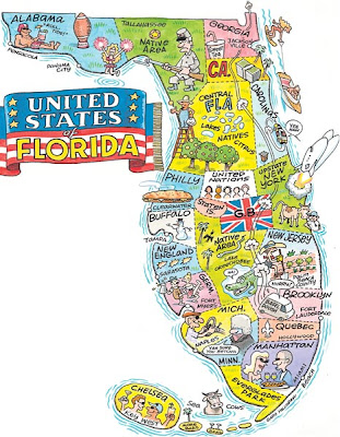
This is a great depiction of a mental map because it demonstrates how people from all over the country and even the world move to Florida. In this mental map the creator illustrates where they believe each region from the US relocates to in the state of Florida. For example in the southwest region they have folks from Michigan, which is usually where many of the snowbirds flee to in order to get away from the weather up north. Miami is where those from Manhattan come down and retire. Central Florida is home to the Brits. I had only added the Disney map, but when I saw this depiction of Florida I had to add this mental map as well.
Original map

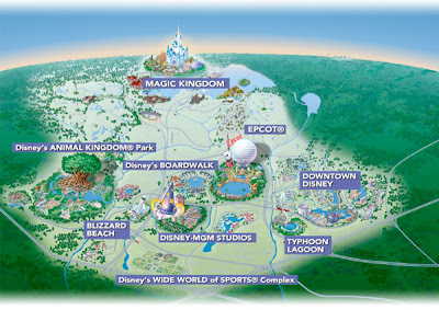
This is a mental map of Walt Disney World Resort in Orlando, FL. The map is not drawn to scale, it's just an approximation of the location of each park in the resort. This map is a picture that someone mentally developed in order to demonstrate the location of each park, and the quantities of parks in the 70,000 square acre Disney property. The map points out each water park, Downtown Disney, MGM Studios, Magic Kingdom, and Animal Kingdom. The picture points out each area of entertainment, however all the hotels and resorts surrounding the parks are left out of the mental map. This picture points out that the creator of this map was trying to demonstrate that the most important part of the resort or the part of the resort that the majority of people want to see are the theme parks.
http://disneyworld.disney.go.com/wdw/parks/maps/mappopup?park=WDWMapPage&bhcp=1